Olympic Logo a Day: Finale.
by Type Tasting


Well done London, how many days until Rio?
“Sarah Hyndman’s year long art project to arrange five everyday objects where you might expect to see the Olympic rings comes to a close today. Take a 1m 49s whizz through 366 remakings of the rings in this project finale movie” Londonist


“…a quirky and amusing collection of alternatives to the Olympic Rings in the now-cult blog” Blueprint Magazine “She sees logos” The New York Times “simple but striking idea” The Londonist “…the Olympics combined with that great sense of British irony” Treehugger “What a silly site!!!” comment on blog
For a year Sarah Hyndman has been remaking the Olympic rings logo out of everyday objects to celebrate the countdown to the start of the Olympics in London. What started as a small, lighthearted idea that paid quiet homage to the power of a well designed logo at the outset, became an exploration of its recognisability in every day life through photographic repetition – often in an abstract way.


The resulting blog has caught imaginations, been blogged, tweeted and featured around the world, and has been viewed in 120 countries in the last 30 days.
After a year of daily remakes, 366 logos (it’s a leap year), the culmination is a movie which shows all the images as they progress through the 12 months, the seasons, holidays and the events that have marked out the year.


Sarah explains that her highlight was when Barnes Primary School created the images that hosted the blog for a month, tying in with the announcement that the 2012 game’s motto is ‘inspire a generation’. “The children asked me questions which I responded to by filming my answers for them. They put a lot of thought and enthusiasm into the project and their logos came complete with clever captions which really made me up my game. I love the photo where’ they’re lying on the ground smiling and waving in the formation of the five rings (day 233).”


Having plundered the every day objects around her extensively, Sarah turned to taking inspiration from events such as Wimbledon, key dates such as Valentines (the day after features broken Loveheart sweets with the caption “it’s complicated”), and taking on tweeted challenges such as Mandy’s request for a logo relating to National Transplant Week (the result is on day 350). The blog has received contributions from people who have, like Sarah, started to see Olympic rings in their everyday lives demonstrating the pervasiveness of the 100 year old icon.


The Olympic Logo a Day blog has been written about in the New York Times, Blueprint magazine, Design Week, The Drum, Follow the Colours Brazil, Logo Design Love, Londonist, Creative Boom, Eye magazine, Dezeen, Handpicked London, Everything London, GQ, Jessica Ennis’ official website, Treehugger and the ‘alternative Olympic posters’ became the ‘top news story’ on Twitter in the week they were released…
Thank you to everybody who contributed: Miho Aishima, Barnes Primary School (Class 3O), Phil Baines, Andreja Brulc, Sarah Chilcott, Peter Edwards, Herbert Wright, Terry Frensham-Page, Barbara Gardner, Hannah Giles, Theo Stewart, Andy, Dexy Doodles, Eddie, Elle Disco, Hayley, Lucy, Nic, Tommaso and everybody else.
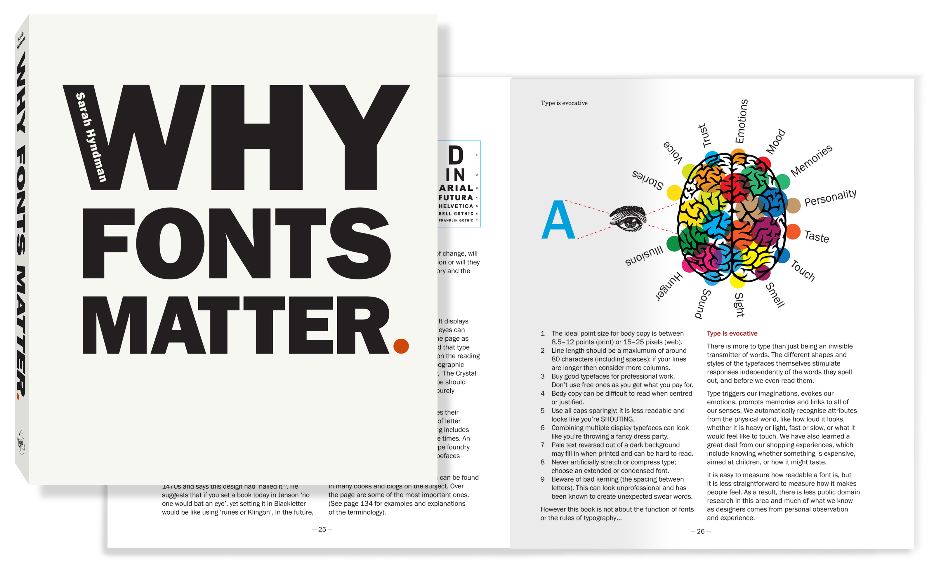
Sarah Hyndman is the author of Why Fonts Matter, published by Virgin Books (Penguin/Random House), January 2016. Find out more …
![]()
![]()
![]()
![]()
![]()
“Fun” “Brilliant” “Inspiring” “Eye-candy” “Enlightening” Amazon reviews
“A fascinating insight into how type can influence our feelings, our senses, and even our taste” Professor Charles Spence, University of Oxford
“This book will make you think and make you laugh”
////////////////////////////
Please note this is a personal, not-for-profit art project. The images cannot be sold, used to promote anything or for commercial gain.

[…] comes to a close today. Take a 1m 49s whizz through 366 remakings of the rings in this project finale movie” Londonist on Olympic Logo a Day “…a quirky and amusing collection of alternatives […]
[…] starting off small -and much like The Drum’s very own Fauxlympics – Hyndman’s blog A Logo A Day has now caught the attention of the world’s social media and has been viewed in over 120 […]